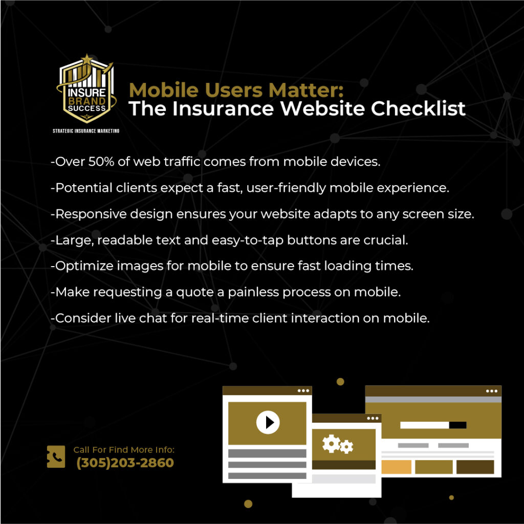
In today’s world, where smartphones are practically an extension of the hand, having a mobile-friendly website is not just a luxury for insurance agencies—it’s a necessity. With over half of all web traffic coming from mobile devices, insurance agents and agencies that fail to optimize their websites for mobile use are missing out on a significant portion of potential clients.
This post is aimed at helping insurance agent owners and managers understand the importance of adopting a mobile-first mindset and providing actionable strategies to improve their websites’ performance on mobile devices. We’ll explore the impact of mobile-friendly design on user experience, SEO rankings, and conversion rates.
Why Mobile Optimization Matters in the Insurance Industry
Imagine a scenario: A potential client is caught in a sudden storm and realizes they need flood insurance. They quickly pull out their smartphone to search for local insurance agencies. If your website takes too long to load or is difficult to navigate, that potential client will likely leave and find a competitor with a faster, easier-to-use mobile site.
This is not an isolated case—people increasingly rely on their mobile devices to search for information, request quotes, and even file claims. According to Google, 53% of mobile site visitors leave a page that takes longer than three seconds to load. As an insurance agency, losing out on mobile users can directly impact your bottom line. Optimizing your site for mobile is no longer optional but essential for success.
A mobile-optimized website offers numerous advantages:
- Increased Traffic and Lead Generation: A website that loads quickly and is easy to use on mobile encourages potential clients to engage, whether they’re requesting a quote or asking for more information.
- Improved SEO: Google prioritizes mobile-friendly websites in search results, making it crucial for SEO performance. Our Insurance SEO Services help agencies optimize their websites to ensure top rankings on Google’s mobile search results.
- Enhanced User Experience: Users expect websites to load quickly and function seamlessly on all devices. A mobile-friendly site enhances the overall user experience, keeping potential clients engaged and more likely to convert into customers.
Key Mobile-Friendly Features for Insurance Websites
To optimize your insurance agency’s website for mobile use, focus on implementing these essential features:
1. Responsive Design
A responsive website automatically adjusts its layout and content based on the user’s device screen size. Whether it’s viewed on a smartphone, tablet, or desktop, the user experience remains consistent. A mobile-responsive design ensures that images, text, and buttons are perfectly scaled for any device, offering a seamless experience.
This feature is critical for insurance agency marketing as it ensures that clients can access your site from any device, increasing the likelihood of engagement. Explore how Websites for Insurance Agencies ensure your site is optimized for every visitor, regardless of device.
2. Fast Loading Times
Mobile users expect fast access to information, especially when it comes to insurance services. A delay in loading can result in lost business. Use tools like Google’s PageSpeed Insights to assess your site’s loading speed on mobile devices and follow recommendations for improvement.
Strategies for improving loading times include:
- Optimizing images by compressing them without losing quality.
- Minifying CSS, JavaScript, and HTML to reduce the size of code files.
- Leverage browser caching to store commonly accessed elements of your website.
A fast website can make or break the user experience, and it’s a critical factor in SEO ranking. Our Insurance SEO Services can help ensure that your site performs optimally in search results.
3. Simplified Navigation
Mobile users have limited screen space, which makes intuitive navigation crucial. Streamline the navigation by:
- Using hamburger menus (the three horizontal lines in the corner) that expand when clicked, saving space while keeping the navigation accessible.
- Ensuring that your most important calls to action (CTA), like “Get a Quote” or “Contact Us,” are large, easy to tap, and prominently displayed.
Simplified navigation improves user engagement and leads to higher conversions, helping clients find exactly what they’re looking for quickly and efficiently.
4. Easy Contact Methods
Insurance clients want fast and easy ways to connect with agents. On mobile, contact options should be obvious and easy to use. Include:
- Clickable phone numbers that allow users to call directly from their mobile devices.
- Contact forms that are optimized for mobile with fewer required fields, making it easy for clients to submit their information without typing out lengthy responses.
For more strategies on enhancing your lead generation and client engagement, consider our Insurance Email Marketing services to build meaningful client interactions.

Mobile-First Content: Engaging Your Audience on the Go
It’s not enough to have a responsive website—your content needs to be tailored for mobile consumption. Keep in mind that mobile users tend to consume content in short bursts, so your messaging needs to be concise and actionable.
1. Bite-Sized Information
Avoid overwhelming users with long paragraphs of text. Break your content into smaller sections, using bullet points or headers to make the information easily scannable.
2. Clear CTAs
Your call to action should be immediately visible and actionable. Whether it’s “Request a Quote,” “Contact Us,” or “Learn More,” ensure that your CTAs are prominently displayed and easily accessible on mobile screens.
3. Social Proof
Highlight client testimonials and reviews to build trust. Mobile users value quick, authentic validation before making decisions. Optimize these testimonials for mobile display to enhance credibility and influence buying decisions.
Speed Matters: Optimizing Mobile Load Times
One of the biggest deal breakers for mobile users is slow load times. Here are some ways to optimize your mobile site speed:
- Use a Content Delivery Network (CDN): A CDN ensures that your site loads quickly no matter where your visitors are located. By storing copies of your site on multiple servers worldwide, content is delivered from the closest server to the user.
- Enable Image Compression: Large images are often the culprit behind slow load times. Use compression tools like TinyPNG to reduce file sizes without sacrificing quality.
- Minimize HTTP Requests: Reduce the number of requests your website makes by combining CSS, JavaScript, and images where possible.
Fast loading speeds lead to better user engagement, higher SEO rankings, and increased conversion rates. Regularly test your website’s speed to identify areas for improvement.
Creating a Seamless Mobile User Experience: What Sets You Apart
A mobile-optimized website is not just about functionality—it’s about delivering an excellent user experience that encourages conversions. Here’s how to ensure a seamless experience for your mobile visitors:
1. Clear Value Proposition
From the moment users land on your mobile site, they should understand exactly what your agency offers and why they should choose you over competitors. Make sure this message is front and center on your homepage.
2. Easy Quote Request Process
Streamline the process of requesting quotes by minimizing form fields and making the process as simple as possible. Only ask for essential information to reduce friction and increase conversion rates.
3. Live Chat Integration
Consider adding a live chat feature to your mobile website. Live chat allows potential clients to connect with an agent instantly, ask questions, and get personalized assistance. This real-time interaction can significantly boost conversion rates.
Implementing the Mobile-First Mindset
By adopting a mobile-first mindset, you ensure that your agency is positioned to meet the growing demand for mobile accessibility. Here are steps to implement this approach:
- Conduct a Mobile Audit: Use Google’s Mobile-Friendly Test to identify areas for improvement.
- Prioritize Mobile Design: Focus on building a mobile-responsive website from the ground up, rather than retrofitting an existing desktop design.
- Optimize for Local Search: Since many mobile searches have local intent, it’s important to optimize your site for local SEO. Ensure your Google My Business profile is complete and accurate, and that you’re targeting local keywords effectively.
Learn more about how local SEO can drive traffic to your mobile site by exploring our AdWords for Insurance Agencies services, designed to connect you with local clients actively searching for insurance.
Conclusion: The Future is Mobile-First
Insurance agencies that prioritize mobile optimization are positioning themselves for success in a rapidly evolving digital landscape. By focusing on responsive design, fast load times, easy navigation, and mobile-specific content, you can create a user experience that drives engagement, builds trust, and increases conversions.
Don’t miss out on the mobile opportunity—start optimizing your insurance agency’s website today for a future where mobile reigns supreme. Whether it’s through improving your SEO, enhancing user experience, or offering streamlined mobile quote requests, being mobile-friendly is a critical component of winning over today’s insurance clients.
Explore more ways to elevate your agency’s digital presence through Insurance Agency Marketing services designed to help you grow.


