
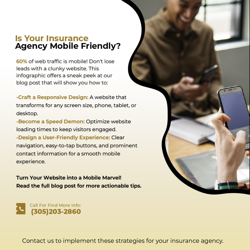
In the world of superheroes, speed and agility are essential. In the world of insurance agencies, it’s your website that needs to be your mobile marvel. Think about it: when was the last time you pulled out your laptop to search for insurance? Chances are, you were on your phone, joining the over 60% of web traffic that now comes from mobile devices.
So, if your website isn’t mobile-friendly, you’re essentially leaving potential customers at the door. Here at EnsureBrandSuccess.com, we specialize in helping insurance agencies like yours leverage the power of digital marketing. Today, we’re diving deep into the world of mobile website optimization, turning your site from a clunky desktop experience to a sleek, user-friendly mobile marvel.
The Responsive Revolution: Why You Need a Responsive Design
Imagine a world where your website transforms to fit any screen size, perfectly displayed on a phone, tablet, or desktop. That’s the magic of responsive design. Think of it like a superhero’s costume that adapts to their every move. Responsive design ensures your website layout adjusts automatically, keeping text readable, images clear, and buttons easy to tap, no matter the device.
Here’s why responsive design is your insurance policy for mobile success:
- Improved User Experience (UX): Frustration is the enemy of conversions. A clunky, non-responsive website forces users to zoom in and out, scroll endlessly, and struggle to find information. Responsive design creates a seamless, frustration-free experience that keeps visitors engaged.
- Enhanced SEO: Search engines like Google prioritize mobile-friendly websites in search results. A responsive design tells Google your website is user-friendly across devices, boosting your search ranking and driving more qualified traffic.
- Increased Conversions: A positive mobile experience is key to converting website visitors into paying customers. Responsive design makes it easy for users to get quotes, contact your agency, or request information, all with a few taps on their phone.
Mobile Speed Optimization: The Race Against the Clock
Nobody likes waiting, especially not impatient mobile users. If your website takes ages to load, visitors will bounce faster than you can say “insurance quote.” Here’s how to ensure your mobile website is a speed demon:
- Image Optimization: Large, unoptimized images are a major culprit behind slow loading times. Use tools to compress images without sacrificing quality.
- Minify Code: Streamline your website’s code by removing unnecessary spaces and characters. This might sound technical, but many website builders have built-in minification features.
- Leverage a Content Delivery Network (CDN): A CDN stores copies of your website’s content on servers around the globe. This ensures faster loading times for users, no matter their location.
The User Experience (UX) Crusade: Creating a Mobile-First Mindset
Your website is the digital face of your agency. On mobile, it needs to be clear, concise, and user-friendly. Here are some UX tips to make your mobile website a user magnet:
- Prioritize the Fold: The “fold” is the area visible on a screen without scrolling. Make sure the most important information – contact details, a call to action, or a clear value proposition – is instantly visible on mobile.
- Simplify Navigation: Complex menus are a nightmare on small screens. Opt for clear, concise navigation with large, easy-to-tap buttons. Consider a hamburger menu (the three horizontal lines) for easy access to additional pages.
- Focus on Calls to Action (CTAs): Tell users what you want them to do – whether it’s getting a quote, requesting a call, or visiting your office. Use clear, action-oriented CTAs like “Get a Quote Now” with large, contrasting buttons.
- Make it Easy to Contact You: Don’t bury your contact information. Make your phone number clickable for a one-tap call, and ensure your email address is prominently displayed. Consider including a contact form optimized for mobile devices.
- Optimize Forms: Long, multi-step forms are conversion killers on mobile. Keep forms short and simple, focusing on essential information. Use autofill options to streamline the process.
Bonus Tip: Embrace the Power of Local SEO
Mobile searches often have a local intent. If someone searches for “car insurance near me,” you want your agency to be the first result. Ensure your website has local SEO elements like your address, phone number, and optimized Google My Business listing. This will make your agency more visible to potential customers in your area searching on their phones.
From Desktop Dud to Mobile Marvel: Taking Action
By now, you’re probably itching to transform your website into a mobile powerhouse. Here’s how to get started:
- Assess Your Current Situation:
The first step is understanding where you stand. Use Google’s Mobile-Friendly Test tool to see how your website performs on mobile devices. This free tool analyzes your website and provides a report highlighting areas for improvement.
- Choose Your Path to Mobile Optimization:
There are three main routes to mobile mastery:
- Responsive Redesign: This is the ideal solution, creating a single website that adapts seamlessly across devices. If you have a web developer, this is the best long-term investment.
- Mobile Theme: Many website builders offer mobile-specific themes that are designed to look good and function well on smartphones and tablets. This is a cost-effective option for agencies with existing websites.
- Mobile-Specific Website: For more complex needs, consider a separate mobile website built specifically for smartphones. This can be more expensive than a theme but offers greater customization.
- Content is King (and Queen) on Mobile:
Remember, even with a fantastic mobile design, content is crucial. Here are some mobile-specific content tips:
- Focus on conciseness: Keep your content clear, concise, and easy to digest on a small screen. Use bullet points, short paragraphs, and strong headlines.
- Optimize for readability: Ensure your font size is large enough to read comfortably on mobile devices. Use high-contrast color schemes for better readability in various lighting conditions.
- Embrace the power of visuals: High-quality, mobile-optimized images and infographics can enhance your content and break up text-heavy sections.
- Consider video content: Short, engaging video snippets can be a great way to explain complex insurance products on mobile devices.
- Test, Optimize, Refine:
Mobile optimization is an ongoing process. Once you’ve made changes, use analytics tools to track user behavior on your mobile website. See how long users stay on your site, which pages they visit, and where they drop off. Use this data to identify areas for improvement and continue refining your mobile experience.
Mobile Marvel: The Takeaway
In today’s digital age, a mobile-friendly website is no longer a luxury, it’s a necessity. By following these tips and prioritizing mobile optimization, you can turn your website from a desktop dud into a mobile marvel that attracts, engages, and converts potential customers. Remember, a seamless mobile experience can be the difference between securing a new client and losing them to a competitor with a faster, more user-friendly website. So, take action today, and watch your insurance agency soar to new heights in the mobile world!
Bonus Tip: Don’t forget to promote your mobile-friendly website! Add a call to action on your social media platforms encouraging users to visit your website and get a quote “on the go.”
By implementing these strategies, you can ensure your insurance agency website is ready for the mobile-first future and continues to be a valuable tool for attracting and converting customers. At EnsureBrandSuccess.com, we’re here to help you every step of the way. Contact us today to discuss your digital marketing needs and learn how we can help your agency thrive online!